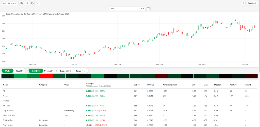
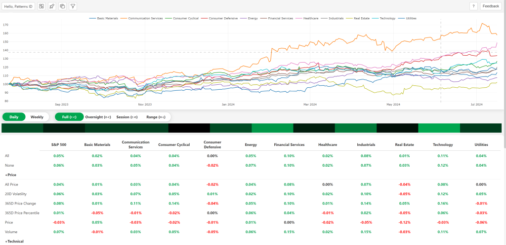
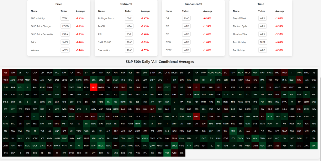
Our latest update brings heatmaps to the dashboard, sectors, and min-max pages. Heatmaps are a fantastic tool that makes it easier than ever to visualize and interpret conditional averages.
What Are Heatmaps?
In simple terms, heatmaps are visual tools that use color to represent data values. This means you can quickly see patterns and anomalies without digging through numbers. On our platform, heatmaps help you get a clearer picture of conditional averages.
Why You’ll Love Using Heatmaps
- Instant Insights: With heatmaps, you can spot trends and outliers at a glance. No more sifting through endless data!
- Easy Comparisons: The color-coding makes it super simple to compare different datasets and see correlations.
- Better Decision-Making: Clear visuals mean you can make more informed decisions based on the patterns and trends you see.
Where to Find Heatmaps
- Dashboard:

- Sectors Page:

- Min-Max Page:

How to Use Heatmaps
- Navigate to the Page: Head over to the dashboard, sectors, or min-max page.
- Hover and Click: Interact with the heatmap cells to see detailed info about each data point.
- Analyze Patterns: Use the color variations to understand trends, compare datasets, and make smarter decisions.
We’re confident that heatmaps will make your data analysis much more intuitive and effective. Give them a try and see the difference for yourself!
